Jotun Middle East Launches Its 2026 Colour Card: Soulful Spaces

Manal Saleh
Jotun Saudi Arabia Launches Its
2026 Colour Card: Soulful Spaces
Al Riyadh, 14 January 2026: It is well known that the colours we surround ourselves with
influence our moods and affect our well-being. The colours we pick for our
homes can therefore have a tremendous impact on our everyday lives – but for
many of us, choosing the shades for our interiors and taking on the task of
decorating can seem like a challenge to overcome rather than a pleasure to
enjoy.
Jotun’s
new 2026 Global Colour Card – SOULFUL SPACES – helps you select and
combine colours and textures to design a space that reflects and inspires you
every day. By following Jotun’s guidance, you will discover how choosing
colours can be a fun and highly rewarding process.
“Colours
have the power to transform not only spaces but also the way we live in them.
With Soulful Spaces, we want to empower people in the region to embrace colour
with confidence, and to see their homes as a canvas for creativity, wellbeing,
and self-expression.”
-
Mahira
Saqib, Regional Colour Marketing Manager, Jotun MEIA
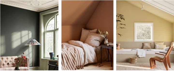
Three styles of
space
Through
inspiring set design and photography, the Colour Card for 2026 demonstrates how
Jotun’s colours can be deployed to create unique ambiences. The card is divided
into three themes; each formed from distinctive families of eight complementary
colours.
PASSAGE OF TIME
Sophisticated,
timeless spaces full of history and soul
Richer,
darker colours, such as deep reds and matt finishes, can be used to create an
air of timeless grandeur and elegance, with warmth and contrast introduced by
golden pinks and glossy surfaces. The perfect backdrop to artworks, artefacts
and statement furniture.
The
golden pink Jotun 20362 Pink Ambience combines beautifully with the deep
reds Jotun 2951 Sophisticated Red and Jotun 2149 Coffee to create
warm and welcoming atmospheres.
Sophisticated
Red is a true classic, infusing the space with glamour and refinement, while
the fresh Jotun 8493 Green Tea on skirting boards and windows adds an
exciting accent to the sophisticated nostalgia.
Dark,
rich and elegant, the deep green Jotun 7613 Northern Mystic appears at
its best in matt paint, making it a perfect match for collected items and
curated interior elements.
For
a more unique expression, Jotun 1974 Golden Walnut is an interesting mix
of brown, yellow and green that pairs beautifully with natural wooden accents.
ART OF
STILLNESS
Bring
softness and silence into the home
An
atmosphere of sanctuary and grounding can be conjured from the sensitive
deployment of soft matt beiges, gentle yellows and blue-green hues. The ideal
space for quiet reflection and moments of mindfulness.
The
new muted yellow Jotun 1965 Ginger Tea brings a touch of sunshine into
the home and blends perfectly with the new golden neutral Jotun 12300
Hazelnut Beige.
To
create a feeling of welcoming warmth and peace, Jotun 12292 Caramel Brown
is a perfect neutral choice – golden beige and almost brown – versatile in
combinations ranging from rustic reds and oranges to fresh blue and bluish
greens.
Lighter
colours add softness and silence, such as the warm golden white Jotun 1625
Soul, a treasured shade from the Jotun archive that pairs beautifully with
golden beiges, browns, and sunny yellows like Ginger Tea.
For
balance, relaxing blue-green hues such as Jotun 6378 Iconic combine the
calmness of evening with the freshness of morning, ideal for rooms where a
subdued atmosphere is desired.
JOYFUL LIVING
Carefree
and country-inspired life with uplifting colours of nature
The
pleasures of rustic, carefree living, rooted in the colours of nature: leafy
greens, soft pinks and light earth tones. Alongside crafted objects and vintage
touches, these colours represent a refined modern take on farmhouse chic.
Fresh,
lush and golden green Jotun 8284 Olive is easy to combine and looks
especially beautiful with dark wood, earthy ochres and peach.
For
a farmhouse character with a refined modern spin, Jotun 11202 Mild Ochre
brings sunny energy with its light, warm tone that hints of peach and orange –
joyful, uplifting and full of vitality.
To
create a sanctuary that feels harmonious and holistic, Jotun 11220 Ochre
Clay in a matt finish delivers warmth and soul. There is also a whisper of
violet in Jotun 20054 Silky Pink, making it an excellent complement to
dark wooden accents.
Finally,
colours like Jotun 8597 Seaweed Green bring the outdoors in, with a
playful yet natural charm that captures timeless, country-inspired beauty.
“Choosing
colours for your home doesn’t have to be intimidating. Like all acts of
creativity, the process should be a joy. With this year’s Global Colour Card,
we’ve set out to give people the knowledge and confidence to find the perfect
personal colour expression for their homes, allowing them to shape a space that
lifts their heart and tells their unique story.”
-
ENDS -
مواضيع ذات صلة
LuLu KSA Launches Convenient Udhiya Pre-Ordering with Free Slaughtering Services*
منذ 8 ساعات . News

AppyThings launches Saudi entity to support AI-native digital infrastructure in the Kingdom
منذ 9 ساعات . News

GWM Unveils Next-Generation GWM ONE S (Gui Yuan) Platform, 4.0T V8 Engine and more at Auto China 2026
منذ 11 ساعة . News

Netflix Announces “The Netflix Effect,”Highlighting Global Economic, Cultural and Social Impact
منذ 11 ساعة . News

New Balance Brings Grey Days to Life with Community-Led Grey Runs Across the Region
منذ 12 ساعة . News

The FIT Series Evolves: HUAWEI WATCH FIT 5 Pro Becomes a Daily Companion for Wellness, Style, and Smart Training
منذ يوم . News
.jpeg)
Accessible Flagship Smartphones Might be the Best Value for Consumers in 2026
منذ يوم . News

Samsung Galaxy S26 Series Launch Dominates Saudi Skies with Exclusive Rotana Signs Nationwide Takeover
منذ يوم . News
.jpeg)
Binghatti Delivers 10th Consecutive Record Quarter with AED 1.43 Billion Net Profit in Q1 2026
منذ يوم . News